
Client: Western Filament Inc.
Year(s): 2025-2026
Website: probraid.com


Probraid is a high-quality braided fishing line that required a recognizable brand that stands out on the shelves at retail locations. Unlike the general trend of most CPGs, fishing line is still predominantly sold at physical locations. This project required a comprehensive research approach into how other fishing line brands target their audiences.
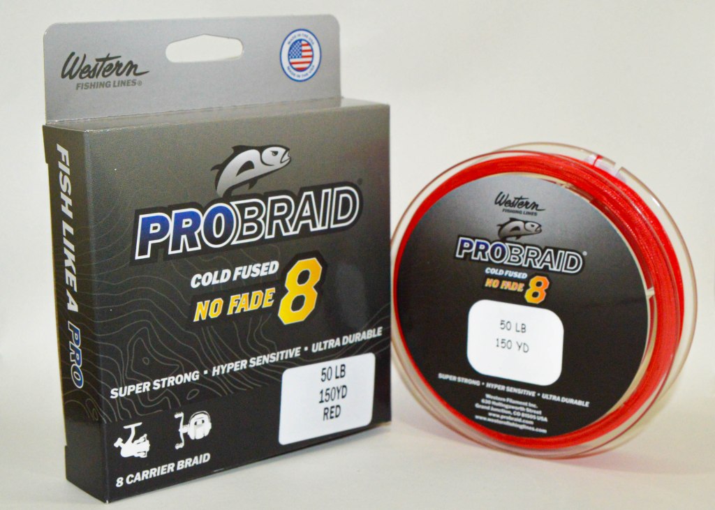
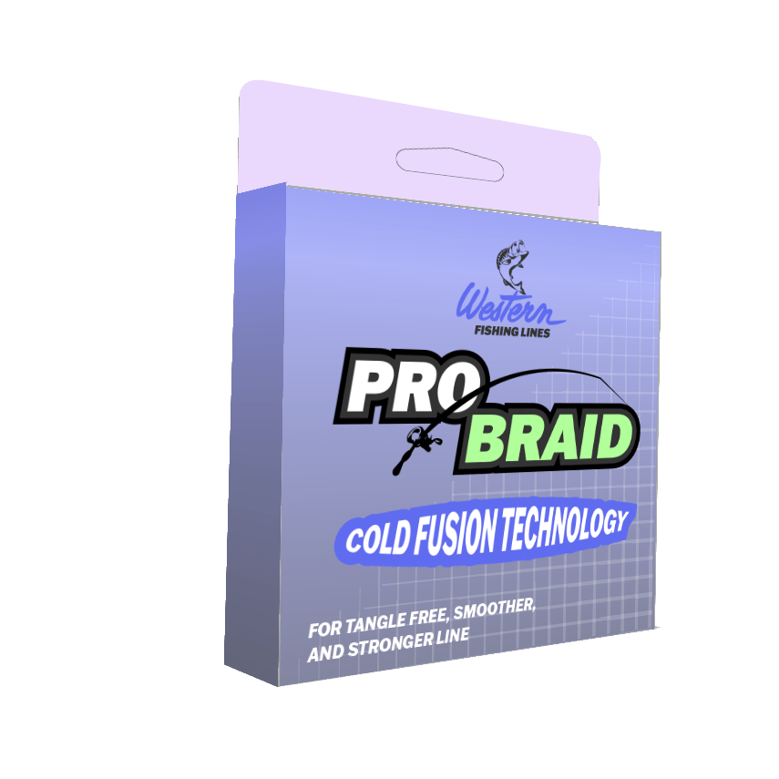
Previous Probraid Branding
The previous packaging was not on par with other competitors, such as Berkley, J-Braid, P-Line, Sufix, Tufline, Stren, and non-direct competitors like Rapala. The colors do not pop, the brand logo is generic and unrecognizable, and the copy used on the front and back of the box lacks a memorable story.


Project Challenge:
Design a fishing line brand representing quality and legacy through branding, packaging, catalog, photo, and website design. This process involves finding impactful brand colors and fonts, and creating a lasting brand image
The brand also required multiple sub-brands that represent an entire line of products. These sub-brands utilize the brand colors and identity to further the brand image.
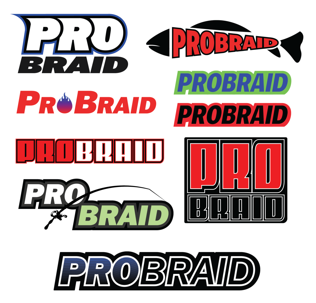
Branding Ideation
Brand marks and logos were rapidly developed and changed to fit the industry. Using input from fishermen and associates, the final design had to fit a sleek, smooth, and precise look that would jump out on the shelves. The final design with the blue gradient was ultimately the best option.
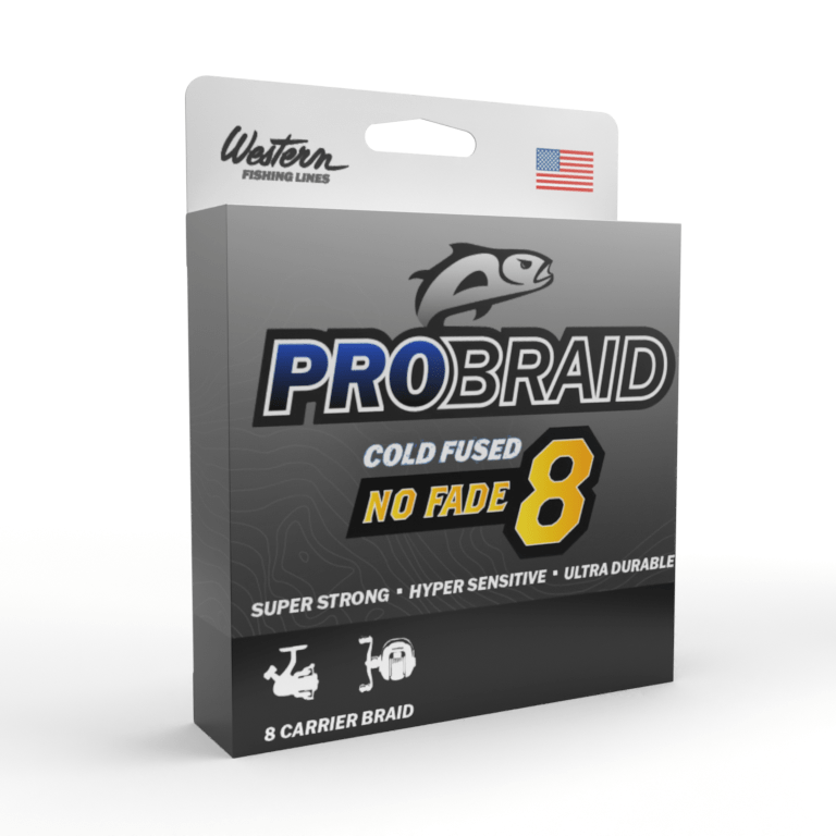
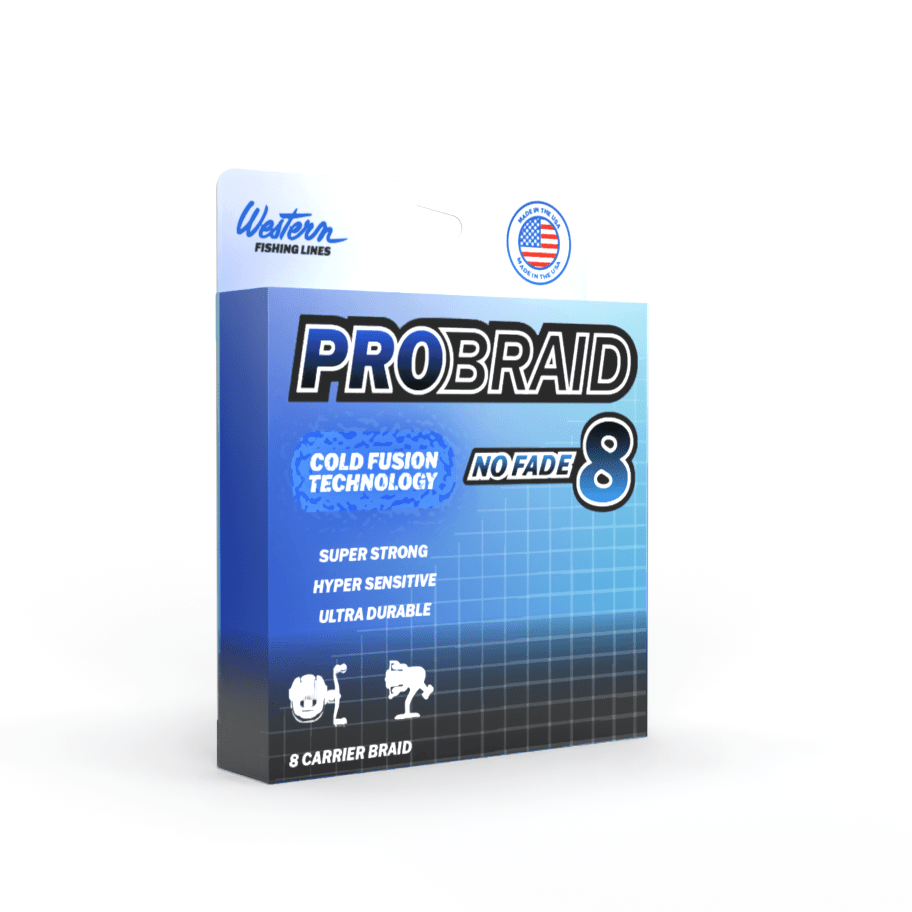
Package Development
To ideate the brand with the needed information, box mockups were produced in Adobe Dimension. The gradients and the black/dark design were meant to show the luxury of this more premium product. Eventually, a topographical map was used in the backdrop to show its versatility in any water. This box created the framework for the brand and the sub-brands within probraid.
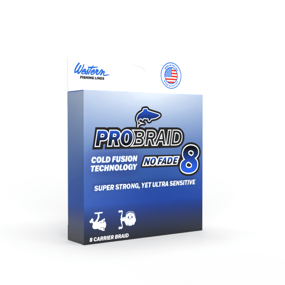


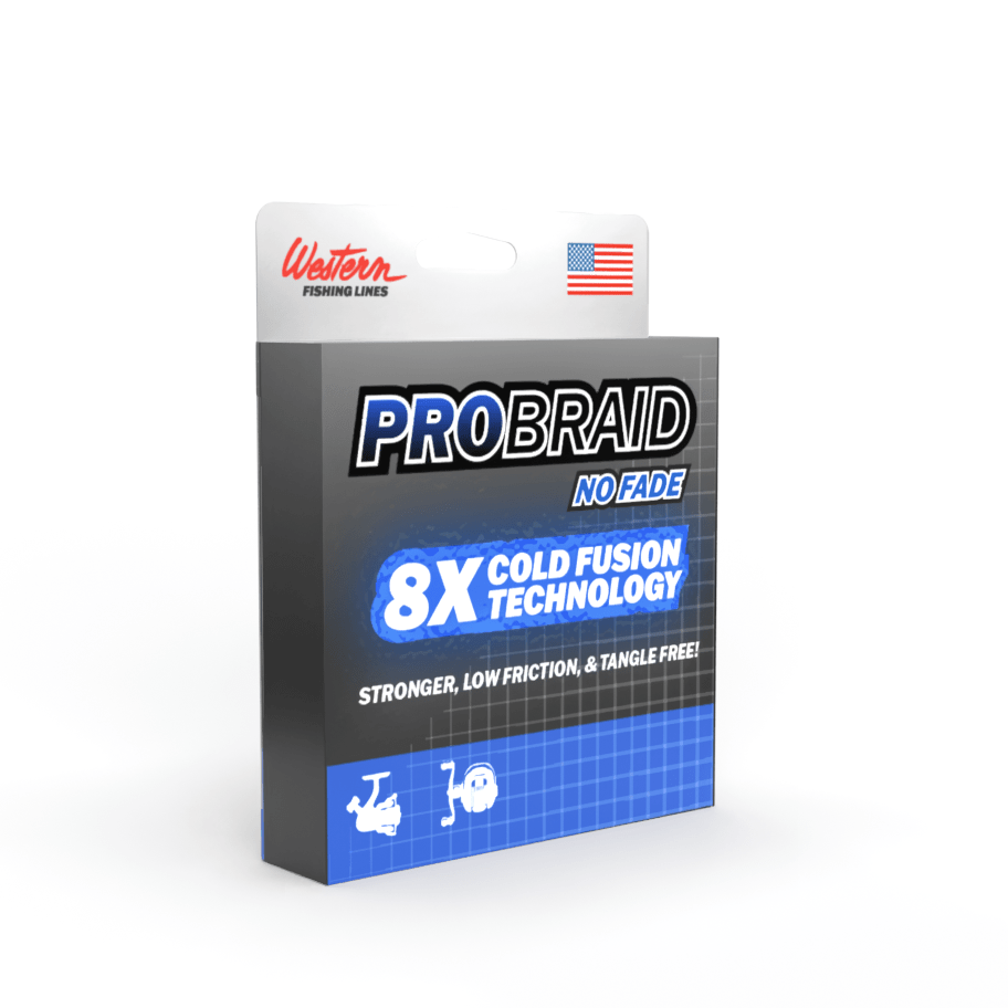
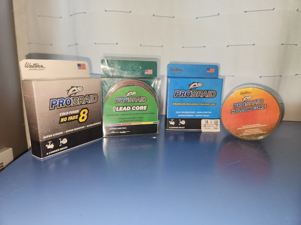
Package Development
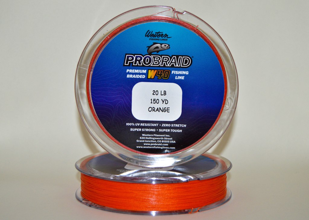
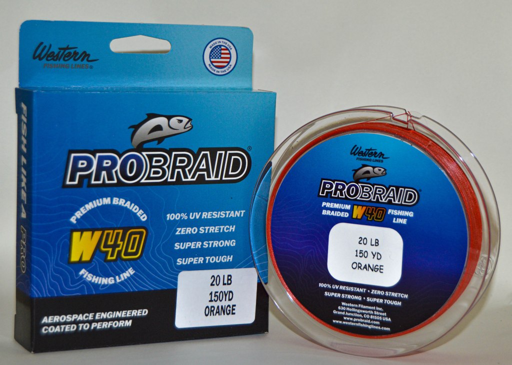
Using the no-fade 8 box, mockups of the premium braided fishing line (W-40), the zero lead core, and the hollow core were created. Lining them up and understanding the brand as a whole helped create a comprehensive fishing line company that would stand out and sell on the shelves.
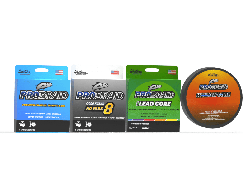
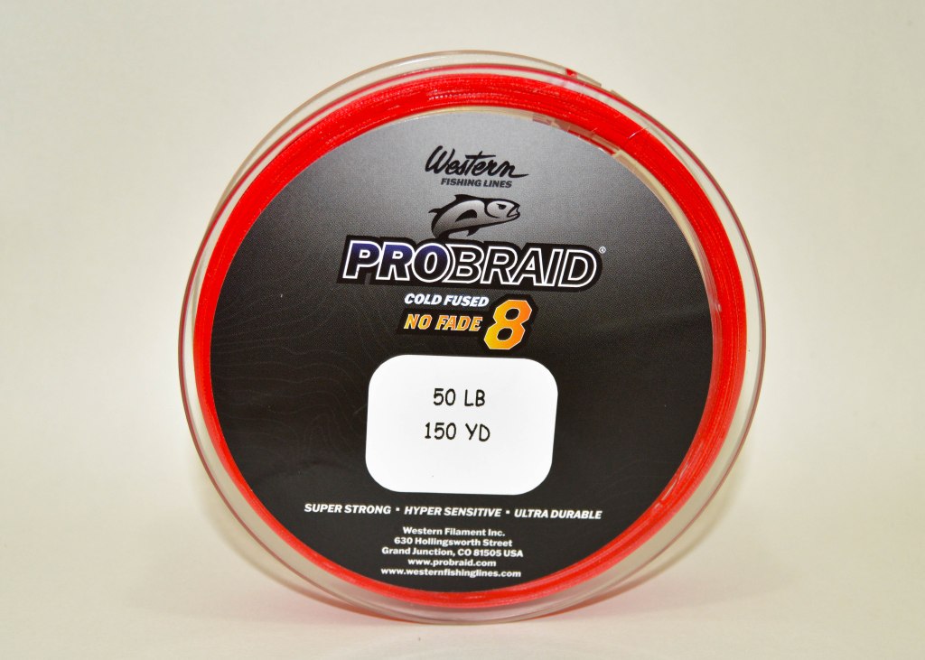
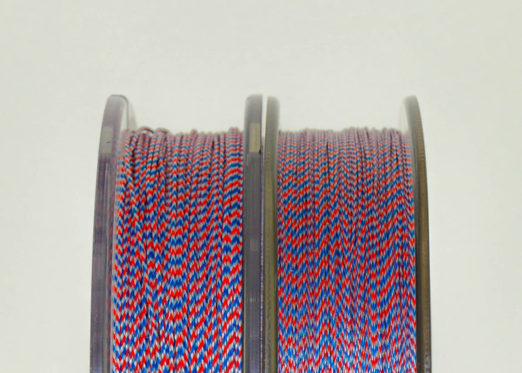
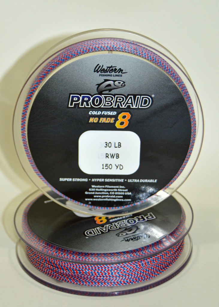
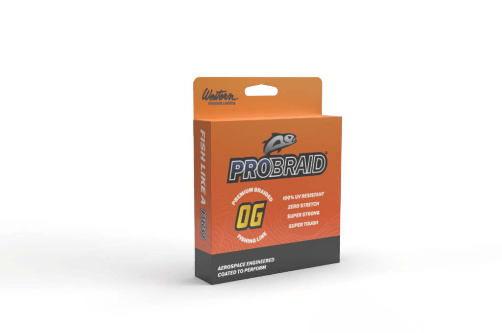
As the brand has developed more, there is now an OG and red, white, and blue package. The OG is orange for the color of the line, and the red, white, and blue line is in a plastic box to show the line qualities.

Brand guidelines
The new brand needed guidelines to follow for social media and web usage. This compiled all the assets from the brand and provided other employees with a path for future marketing efforts
Website Development
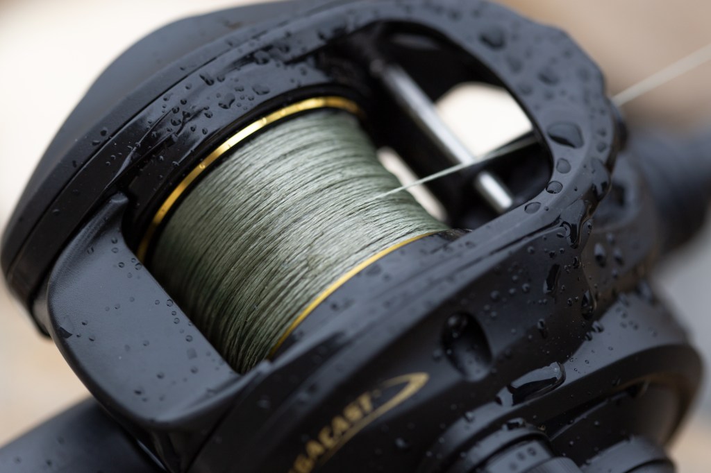
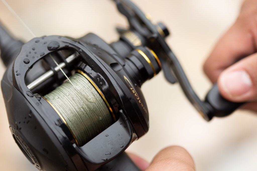
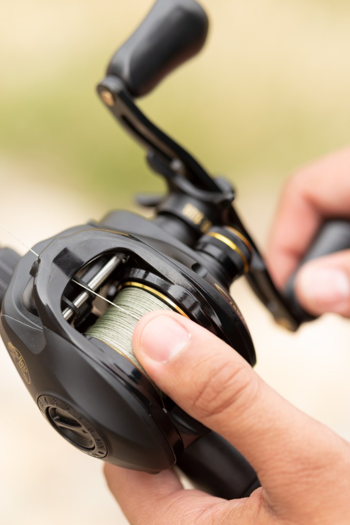
Finally, using the brand imagery and product photos, the website was designed. By first understanding the products and then designing the site, it was intuitive how it should be laid out. Separating the brands and using familiar images allows for familiarity with the users and brand recognition.